Put some breathe life in your papers with clever visualization
- Abhishek Tiwari
- Research
- 10.59350/phxdg-7vb04
- Crossref
- March 2, 2010
Table of Contents
I often screen papers for my reading list based on their illustration appeal. I know this may be bit strange for the people who judge the papers simply based on their abstracts or conclusion section. But trust me it works because I know what I am looking for. I always avoid the sleep inducing papers full of creepy tables and bar graphs, in fact so lacking in interest as to cause mental weariness.
When I say illustration appeal, I mean something which can inspire your readers to wake them up, something which can give enough value for their time and effort to read your technical jargon. In simple words put some dazzle in your paper. Having said that I think the scientist are very poor on communicating their results in a stimulating way. I am not talking about the blogs or their writing skills, I am certainly speaking about how to create the visual impact for your scientific article.
Why this is so important now, because with emergence of data intensive science things begin to get very complicated. Science is constantly shifting landscape, both in terms of data type and quantity. We are swamped by data deluge and next generation of science not only demands better data management skills but also superior ability to present the data in a innovative way so that we can enable discovery in this noisy environment.
Thinking about clever visualization always inspires chance discovery. Rather than restructuring you write-up again and again, spent time to find new inspiring ways to visualize your data. The only reason you’re still using old chart and graphs is you did not attempt. Try to inspire yourself by looking in other domains first, there is always a possibility to mix and fix existing visual schemes according to your needs.
For instance, in a latest PNAS paper Carlson et. al have presented interactive Sequence Specificity Landscapes SSLs) which simultaneously displays the affinity and specificity of a million-plus DNA sequences by plotting them as several concentric circles. That’s a hell of a lot of innovation. Circular SSLs display the binding intensities of a given DNA ligand across all DNA permutations. For the inspiration they looked “from the energy funnels used to represent protein folding to the painting of twentieth-century master of shape and color Wassily Kandinsky”. This is one of the examples where visual thinking has changed the final outcome.
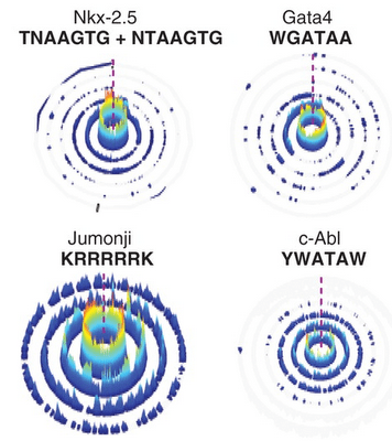
In a circular SSL, the innermost ring displays sequences that contain a perfect match to a given seed motif (0-mismatch). The subsequent circles, going outward, represent increasing mismatches from the seed motif. The height of each color-coded peak on the individual rings corresponds to the CSI binding intensity data.
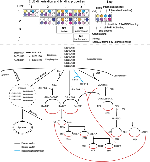
To convince you more I will give another example, this one is picked from the paper published by Chen et. al in Molecular Systems Biology. The ErbB signaling pathways is very complex which arises from hetero- and homo-oligomerization among receptors having distinct ligand-binding properties and different intracellular binding partners, and from the multiplicity of intracellular proteins that interact with these receptors. Consider all permutations and combinations, and you will come up with reaction network worth 3 pages (check out the supplementary material for the paper and how much complex it was). They came up with a simplified schematic representation of their ErbB model in a more intuitive way. I was so impressed that I was not surprised to see the number of citations this article has collected in a very short time.
I am sure these are only few selected examples which I came across, there are lot more to learn and that’s what really inspire us. This kind of effective visuals illustrations are very helpful in dissemination of scientific knowledge.
Reference:
Carlson, C., Warren, C., Hauschild, K., Ozers, M., Qadir, N., Bhimsaria, D., Lee, Y., Cerrina, F., & Ansari, A. (2010). Specificity landscapes of DNA binding molecules elucidate biological function Proceedings of the National Academy of Sciences, 107 (10), 4544-4549 DOI: 10.1073/pnas.0914023107
Chen, W., Schoeberl, B., Jasper, P., Niepel, M., Nielsen, U., Lauffenburger, D., & Sorger, P. (2009). Input–output behavior of ErbB signaling pathways as revealed by a mass action model trained against dynamic data Molecular Systems Biology, 5 DOI: 10.1038/msb.2008.74
De Souza, N. (2010). The DNA-binding landscape Nature Methods, 7 (4), 254-255 DOI: 10.1038/nmeth0410-254a